Vayda’s Flowers
Project Overview
Jan 2024 - March 2024
I worked as a solo UIUX designer and researcher for fictitious Vayda’s Flowers. After multiple rounds of wireframing, prototyping, and user testing, I designed a mobile app that allows users to preview and order bouquets. In three months, I delivered a completed design for the app and design system.
Problem Summary
Our users need a simple and easy way to select and purchase bouquets to show appreciation to their loved ones without needing the time and resources to go to the shop in person.
Initial User Research
I conducted early user research with 7 participants. My goal was to establish what key functions and features would be most important for users when viewing flowers, selecting bouquets, and completing the ordering process.
Key Research Questions:
Understanding User Behavior
Can you describe the last time you purchased a bouquet? What motivated you to buy it, and what factors influenced your decision?
Challenges in Bouquet Selection
Walk me through your process of selecting and purchasing a bouquet for a special occasion. What challenges, if any, did you encounter during this process?
Technology Adoption and Preferences
How comfortable are you with using technology when it comes to selecting and ordering items?
Have you ever used digital tools or apps for selecting/previewing bouquets?
What features or functionalities would you find most useful in a bouquet preview app?
Initial Ideating & Wireframing
User Experience Research Study
The research goals were to identify specific difficulties customers encounter when ordering, previewing, and customizing bouquets on the Vayda’s Flowers app via an unmoderated usability study with 5 participants.
Key Research Questions:
Identifying User Difficulties
How long does it take for users to select and purchase a bouquet?
Are users able to preview bouquets, and return to the item without error?
Are there any areas on the app where customers are more prone to making errors or getting stuck?
Is inputting delivery & payment info seamless for customers?
Do users have an overall positive experience with the navigation and structure of the app?
Prompts & Questions for Users:
Prompt 1 From the home screen, browse bouquets
How easy or difficult was it to browse bouquets? Is there anything you would change about the process?
Prompt 2 Preview/enlarge a bouquet, and return to item info
How easy or difficult was this task to complete? Were you able to navigate from previewing back to the item with ease? Would you change anything about the process?
Prompt 3 Add a bouquet to cart & navigate to cart
How easy or difficult was the customization process? Did you encounter any roadblocks while building your bouquet?
Prompt 4 Confirm your order and complete the checkout process
How easy or difficult was it to complete your order? How clear or cumbersome did you find the steps to complete your order & enter your payment details?
Hi-Fi Mockups
A Quick & Easy Ordering Process
In Person Shopping is Tedious & Inconvenient
Reliable & High Quality Bouquets
Inability to Customize & Lack of Options
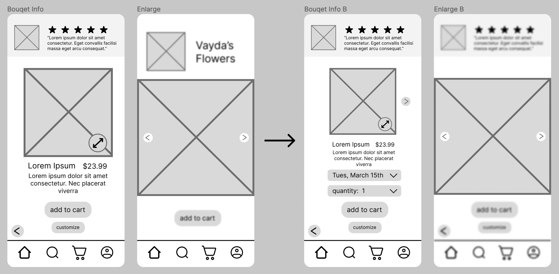
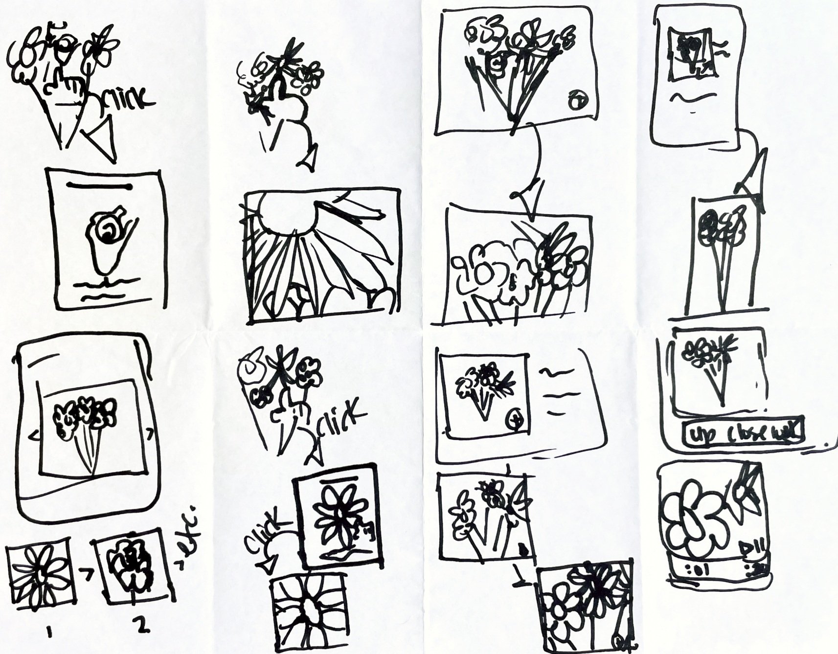
An insight from early research is that enlarging the images of the bouquets is essential for accessibility and to improve the experiences for all users. Using Crazy 8s, I ideated potential solutions, and after conferring with peers I chose to design an arrow on the bouquet image that enlarges the photo, and allows the user to click back and forth between photos, as seen in the wireframes below.
Cumbersome Check Out Processes
our users want
01
our users’ frustrations
01
01
02
03
&
05
key learnings
03
03
Once in Figma my initial goals were to keep the user flow simple, call to actions at a larger proportion, and tackle other noted research frustrations in the following ways:
1 an enlarge feature for the bouquets
2 added reviews on the individual bouquet’s page to help assure quality & reliability
3 reduce checkout steps as much as possible
At this point I created the first iteration of hi-fi mock up for Vayda’s Flowers
Based on user feedback from the study, I established 5 insights.
04
After making necessary changes based on user insights, I realized I also needed a Sign In or Guest page, and a Delivery Info page
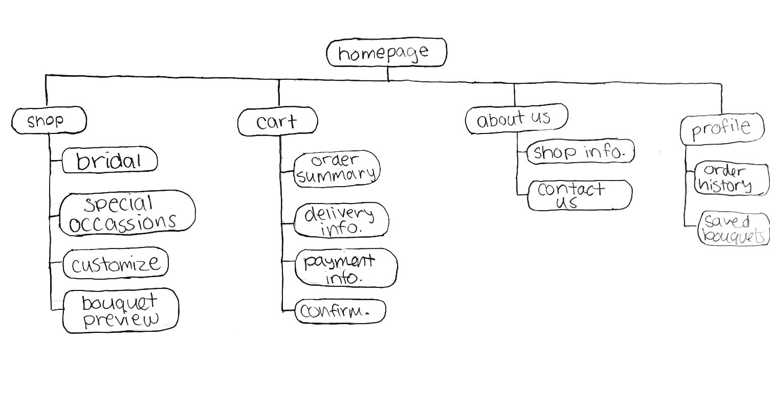
After establishing a basic user flow, I developed an Information Architecture to help guide my flows and interactivity as I moved from paper to Figma.
Users are unsure of how to get out of the “Enlarge” page
Users need a way to select the date for pick up/delivery
Users want filters on the page with all bouquets listed
Users want a more convenient way to pay
After initial color research and experimenting, I created a base color scheme for the app.
After reviewing the mockups myself, and getting feedback from peers, I iterated on the design once more and made the following adjustments
Final Design
Once establishing a color scheme I created branded navigation icons, and variations of the navigation bar.
1 adding a pick up/delivery date that was missing in the first design
2 adjusting my color scheme to focus more on contrast and improving UI aesthetic
3 including text labels under icons for accessibility purposes
Clear, Large Imagery & Numerous Options
Users cannot adjust quantity or remove items from cart


